Discover the fascinating stories behind some of the world’s most iconic company logos. From their humble beginnings to the symbols they have become today, these logos carry with them tales of creativity, innovation, and sometimes sheer coincidence.
Each logo not only represents a brand but also encapsulates unique elements of history and design ingenuity, reflecting the vision and values of the companies they stand for.
Join us as we explore the intriguing origin stories behind these 42 famous logos.
1. Apple
Apple’s first logo, crafted by Ronald Wayne, featured the image of Isaac Newton beneath an apple tree. This design was quickly replaced by Rob Janoff’s now-famous bitten-apple silhouette.
The bite in the apple was a clever play on the word ‘byte,’ linking it to technology, while also differentiating it from a cherry.
The simplicity and elegance of the new design captured the essence of modern technology, while the bitten apple symbolized knowledge, echoing the biblical story of the Tree of Knowledge. This logo helped position Apple as a leader in innovation and creativity.
2. Amazon
Amazon’s logo, with its distinctive arrow pointing from ‘A’ to ‘Z’, cleverly suggests that the company offers a vast selection of products. This design element also forms a smile, representing the company’s commitment to customer satisfaction.
The understated simplicity of the logo reflects Amazon’s straightforward approach to e-commerce. By visually indicating that shoppers can find anything they need, the logo embodies the idea of convenience and diversity.
The smile evokes a sense of friendly service, aligning with Amazon’s brand philosophy of making shopping an enjoyable experience for customers worldwide.
3. Starbucks
Starbucks’ logo is inspired by a 16th-century Norse woodcut of a two-tailed mermaid, or siren. The founders selected this mythical creature to symbolize allure and mystery, fitting for a brand born in Seattle, a major port city.
The siren’s image captures the imagination and suggests that Starbucks coffee offers an irresistible experience. The circular design and iconic green color create a sense of community and environmental consciousness.
This emblem reflects the brand’s commitment to quality and its maritime roots, inviting customers to explore the rich, flavorful world of Starbucks coffee.
4. Nike
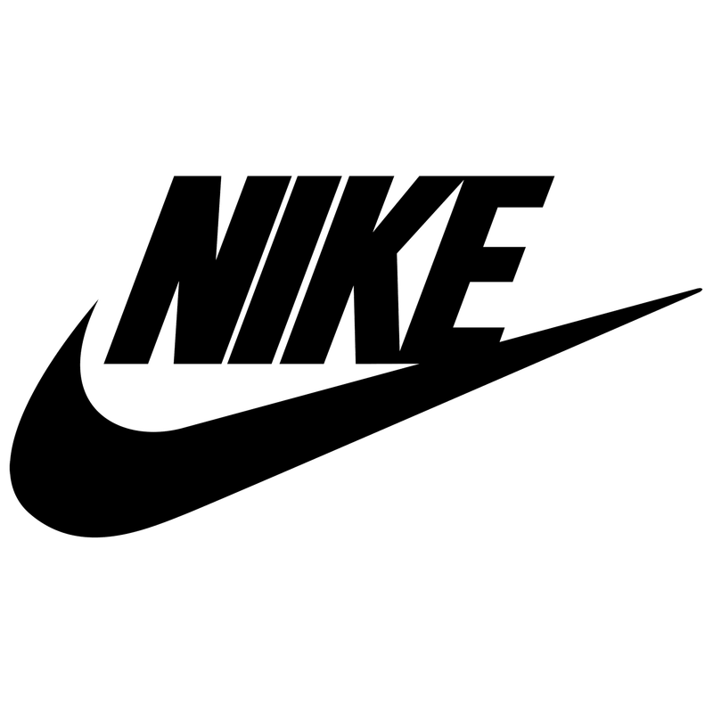
Nike’s swoosh logo, one of the most recognized symbols in the world, was designed by Carolyn Davidson in 1971 for a mere $35. The swoosh represents the wing of Nike, the Greek goddess of victory, and embodies movement, speed, and agility.
Its sleek, dynamic form captures the essence of athleticism and performance. Over the years, the swoosh has become synonymous with excellence and innovation in sportswear.
Nike’s commitment to empowering athletes everywhere is reflected in this simple yet powerful logo that continues to inspire confidence and determination.
5. Pepsi
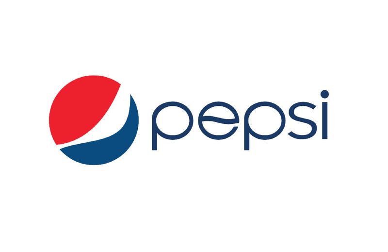
Pepsi’s logo has undergone numerous transformations since its inception as ‘Brad’s Drink’ in 1893. The modern globe icon, formalized in 2008, features red, white, and blue waves that denote the brand’s American heritage and youthful energy.
The circular design suggests unity and global reach, emphasizing Pepsi’s position as a leading soft drink brand. The vibrant colors and fluid motion convey a sense of dynamism and refreshment, appealing to a broad audience.
This iconic logo captures Pepsi’s tradition while adapting to contemporary tastes, making it a timeless symbol in the beverage industry.
6. Coca-Cola
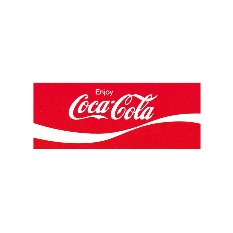
Coca-Cola’s logo, with its flowing script font, was designed by Frank Mason Robinson in the late 1800s. This timeless design has remained largely unchanged for over a century, reflecting the brand’s commitment to tradition and quality.
The elegant curves of the lettering evoke a sense of refreshment and enjoyment, resonating with consumers across generations. Coca-Cola’s iconic red color further enhances the logo’s appeal, symbolizing energy, passion, and excitement.
This enduring emblem captures the essence of a brand that has become synonymous with happiness and shared moments, making it a staple in global culture.
7. McDonald’s
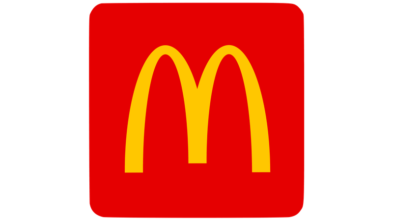
McDonald’s Golden Arches, an iconic symbol of the fast-food giant, were inspired by the restaurant’s original architecture. In the 1960s, designer Jim Schindler merged these arches into the recognizable ‘M’ that stands today.
The arches represent a beacon for hungry travelers, emphasizing the brand’s accessibility and convenience. This design has become a global symbol of consistency and quality, embodying McDonald’s commitment to serving delicious food quickly.
The bright yellow color adds an element of warmth and friendliness, inviting customers into a familiar and welcoming dining experience.
8. Twitter
Twitter’s bird logo, originally purchased for $15 from a stock image site, has evolved into a symbol of modern communication. The current minimalist design captures the essence of Twitter – quick, concise, and dynamic messages that ‘fly’ across the internet.
The bird symbolizes freedom of expression, a core value of the platform, while its upward flight represents the spread of ideas and information. The simplicity of the design ensures versatility and wide appeal, making it instantly recognizable.
Twitter’s logo embodies the brand’s mission to connect people and facilitate global conversations.
9. Google

Google’s logo, designed by Ruth Kedar in 1999, features a playful use of primary colors with one exception – the green ‘L’. This subtle deviation symbolizes Google’s tendency to break rules and innovate.
The clean, sans-serif font reflects the company’s commitment to simplicity and clarity in its mission to organize the world’s information. The vibrant colors convey a sense of fun and creativity, appealing to a broad audience.
Google’s logo is a testament to the brand’s ethos of exploration and discovery, encouraging users to engage with technology in new and exciting ways.
10. IBM
IBM’s logo, revamped by Paul Rand in 1972, incorporates horizontal stripes that suggest speed and dynamism. This design reflects the company’s identity as a leader in technology and innovation.
The bold, solid letters communicate stability and reliability, key attributes of IBM’s brand. The logo’s simplicity and strength convey a sense of professionalism and trustworthiness, aligning with IBM’s commitment to delivering cutting-edge solutions.
As a symbol of technological advancement, IBM’s logo resonates with clients and partners alike, reinforcing its position as a global powerhouse in the industry.
11. Shell

Shell’s logo, featuring a pecten shell, dates back to the early 1900s when the company initially focused on importing seashells from Asia. Over time, this emblem has become synonymous with the brand’s identity as a global energy leader.
The simple yet bold design is instantly recognizable, symbolizing strength and continuity. The vibrant red and yellow colors convey warmth and optimism, reflecting Shell’s commitment to sustainability and innovation.
This enduring logo represents a rich heritage and a forward-thinking approach, making it a powerful symbol in the energy sector.
12. Mercedes-Benz

Mercedes-Benz’s three-pointed star logo was conceived by Gottlieb Daimler to symbolize his ambition to power vehicles on land, sea, and air. This emblem, which merged with Benz’s laurel wreath in 1926, represents the fusion of engineering excellence and elegance.
The star’s sleek and minimalist design exudes luxury and sophistication, qualities that define the Mercedes-Benz brand. As a symbol of innovation and quality, the logo reflects the company’s commitment to creating high-performance vehicles that inspire confidence and prestige.
Mercedes-Benz’s logo stands as a beacon of automotive excellence and heritage.
13. Volkswagen
Volkswagen’s iconic ‘VW’ logo originated from a design competition in 1938. The letters ‘VW’ stand for ‘Volkswagen,’ meaning ‘people’s car’ in German, while the circular gear-like border suggests engineering prowess and unity.
This logo has evolved over time, maintaining its core identity while adapting to modern aesthetics. The sleek and simple design reflects Volkswagen’s commitment to quality, reliability, and innovation in automotive engineering.
As a symbol of unity and engineering excellence, the Volkswagen logo resonates with customers worldwide, representing a brand that values tradition and forward-thinking solutions.
14. FedEx
FedEx’s logo, designed by Lindon Leader, is renowned for its clever use of negative space to create a hidden arrow between the ‘E’ and ‘x’. This design element symbolizes speed, precision, and efficiency, core values of the FedEx brand.
The bold typography and contrasting colors enhance the logo’s visibility and impact. As a leader in logistics and delivery services, FedEx’s logo reflects its commitment to reliable and timely service.
The arrow represents forward movement and progress, aligning with FedEx’s mission to connect people and businesses through fast and efficient delivery solutions.
15. UPS
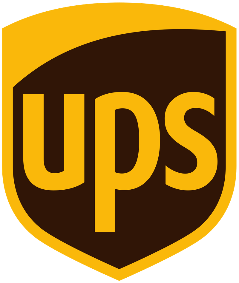
UPS’s logo, designed by Paul Rand in 1961, features a shield that conveys reliability and security. Originally, the logo included a package tied with string atop the shield, reflecting the company’s focus on delivery services.
Over time, the design has become more streamlined, with the modern version emphasizing simplicity and strength. The brown color palette is distinctive and memorable, reinforcing UPS’s identity as a trusted provider of logistics solutions.
This logo embodies the company’s commitment to dependable service and innovation in the delivery industry, making it a symbol of trust and efficiency.
16. LG
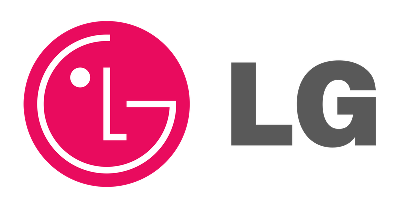
LG’s logo, with its face-like design, cleverly combines the letters ‘L’ and ‘G’ to form a human-like figure. This design represents the brand’s focus on humanity and global connectivity, aligning with its motto, ‘Life’s Good.’
The circular shape suggests unity and harmony, while the bold red color conveys energy and vibrancy. As a technology leader, LG’s logo reflects its commitment to innovation and enhancing the quality of life through cutting-edge products.
This emblem captures the brand’s ethos of making life better and more connected for people around the world.
17. Mastercard

Mastercard’s logo, introduced in 1969, features overlapping red and yellow circles that symbolize unity and cooperation. This design reflects the brand’s role in connecting people and businesses through seamless payment solutions.
In 2016, Mastercard updated its logo to a minimalist design, retaining the classic circles while enhancing clarity and modernity. The vibrant colors convey energy and optimism, aligning with Mastercard’s commitment to innovation and inclusivity.
As a global leader in financial services, Mastercard’s logo embodies the brand’s dedication to empowering individuals and businesses through secure and efficient payment systems.
18. KFC
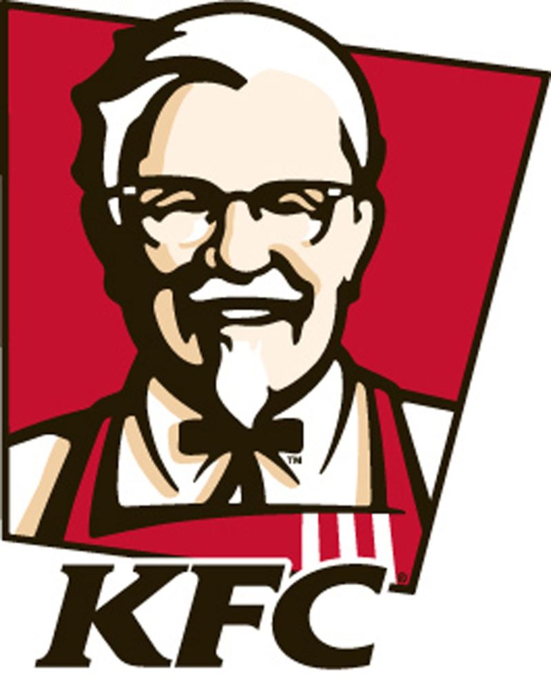
KFC’s logo, featuring Colonel Sanders, became the face of the brand in the 1950s. His distinctive white suit and goatee are synonymous with Kentucky Fried Chicken and Southern hospitality.
This iconic image reflects the brand’s commitment to quality and tradition in serving delicious fried chicken. The warm colors and friendly demeanor of Colonel Sanders create a welcoming atmosphere, inviting customers to enjoy a taste of Southern comfort.
As a symbol of culinary excellence and hospitality, KFC’s logo captures the essence of a brand that has delighted taste buds for generations.
19. Baskin-Robbins
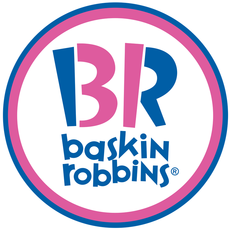
Baskin-Robbins’ logo cleverly incorporates the number ’31’ within the pink portion of the ‘B’ and ‘R’, highlighting the brand’s promise of offering a different flavor for each day of the month. This playful design emphasizes variety and innovation in ice cream.
The vibrant colors convey fun and excitement, appealing to both children and adults. As a leading ice cream brand, Baskin-Robbins’ logo reflects its commitment to creativity and quality in crafting delightful frozen treats.
This emblem invites customers to explore a world of flavors and indulge in the joy of ice cream.
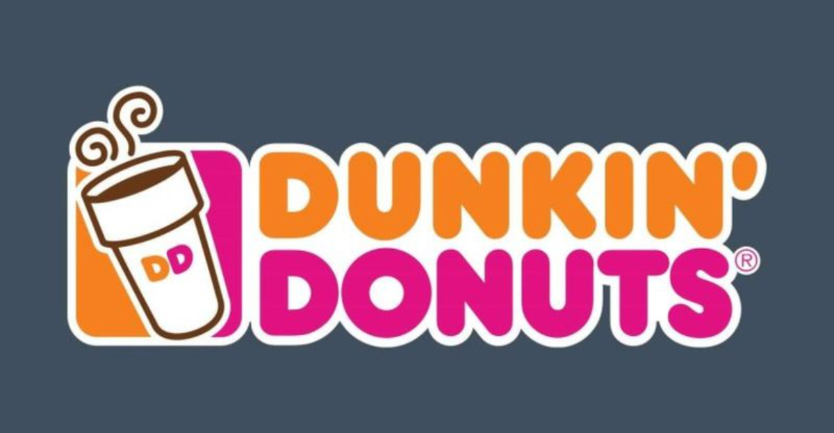
20. Dunkin’
Dunkin’s logo, with its bright orange and pink colors, has been a staple since 1976. The energetic color palette evokes feelings of joy and vitality, perfectly suited for a brand that kickstarts mornings with coffee and baked goods.
In 2019, Dunkin’ dropped ‘Donuts’ from its name, simplifying the logo to reflect its broader focus on beverages and snacks. The warm and inviting design aligns with Dunkin’s mission to provide comfort and convenience to its customers.
This logo embodies the spirit of a brand that fuels daily routines and brings people together over a shared love of coffee.
21. Netflix
Netflix’s logo, featuring a bold red ‘N’, was introduced in 2014 to reflect the company’s evolution from DVD rentals to digital streaming. The striking red color conveys energy and passion, aligning with Netflix’s commitment to delivering captivating content.
The minimalist design ensures versatility and easy recognition across various platforms. As a pioneer in the entertainment industry, Netflix’s logo embodies the brand’s dedication to innovation and redefining how audiences experience media.
This emblem represents a world of endless entertainment possibilities, inviting viewers to explore a diverse range of shows and movies.
22. Canon
Canon’s logo has evolved significantly since the company was initially named ‘Kwanon’ after the Buddhist Goddess of Mercy. The transition to ‘Canon’ marked a rebranding effort to appeal to a broader audience.
The current sleek, bold red script reflects the brand’s focus on quality and innovation in imaging technology. The elegant design conveys precision and reliability, key attributes of Canon’s products.
As a leader in the photography and imaging industry, Canon’s logo symbolizes its commitment to advancing technology and capturing life’s moments with clarity and excellence.
23. Leica
Leica’s logo, with its classic cursive font encased in a red circle, has become a symbol of excellence in photography. The name ‘Leica’ is a combination of founder Ernst Leitz’s surname and ‘camera,’ reflecting the brand’s deep-rooted history in the industry.
This iconic logo serves as a quality seal for photography enthusiasts and professionals alike. The elegant design and vibrant red color convey a sense of passion and craftsmanship.
As a pioneer in camera technology, Leica’s logo embodies the brand’s dedication to innovation and its legacy of capturing the world through a lens.
24. Hewlett-Packard (HP)

Hewlett-Packard’s logo, featuring a simple monogram ‘hp’ encased in a circle, symbolizes technical precision and innovation. The brand’s name, derived from founders Bill Hewlett and Dave Packard, was decided by a coin toss.
The sleek design and cool blue color convey professionalism and reliability, aligning with HP’s commitment to delivering cutting-edge technology. As a leader in the tech industry, HP’s logo reflects its dedication to enhancing productivity and creativity through innovative solutions.
This emblem represents a brand that values quality and customer satisfaction, making it a trusted name in computing.
25. Wendy’s
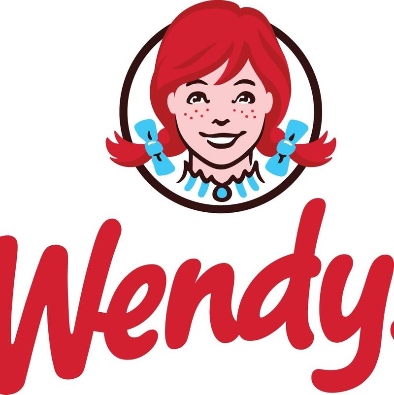
Wendy’s logo, featuring the redheaded mascot named after founder Dave Thomas’s daughter, Wendy, conveys a sense of warmth and nostalgia. The collar of the mascot subtly spells ‘MOM,’ alluding to the homey feeling of comfort food.
This clever design element reflects Wendy’s commitment to quality and tradition in serving delicious meals. The cheerful expression and bright colors create an inviting atmosphere, appealing to families and individuals alike.
As a symbol of freshness and quality, Wendy’s logo captures the essence of a brand that values authentic flavors and customer satisfaction.
26. Target
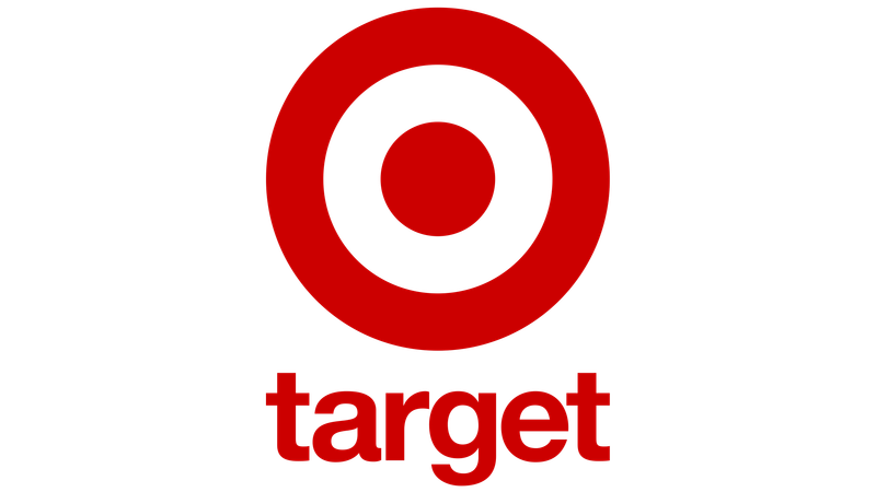
Target’s bull’s-eye logo was chosen in 1962 to emphasize a direct hit on value, reflecting the brand’s commitment to offering quality products at affordable prices. The red and white color scheme is instantly recognizable and easy to spot in stores, enhancing brand visibility.
This simple yet effective design conveys a sense of precision and focus, aligning with Target’s mission to provide a convenient and enjoyable shopping experience. As a symbol of affordability and style, Target’s logo captures the essence of a brand that appeals to a wide range of consumers.
27. Adobe
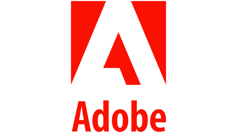
Adobe’s logo, featuring a stylized ‘A’, was designed by Marva Warnock in 1982. The clean and modern design reflects the brand’s commitment to creativity and digital innovation.
The sharp angles and bold lines convey a sense of precision and technological advancement, aligning with Adobe’s role as a leader in creative software. The bright red color symbolizes passion and energy, appealing to designers and artists worldwide.
As a symbol of creativity and innovation, Adobe’s logo represents the brand’s dedication to empowering individuals and businesses through powerful digital tools and solutions.
28. Microsoft
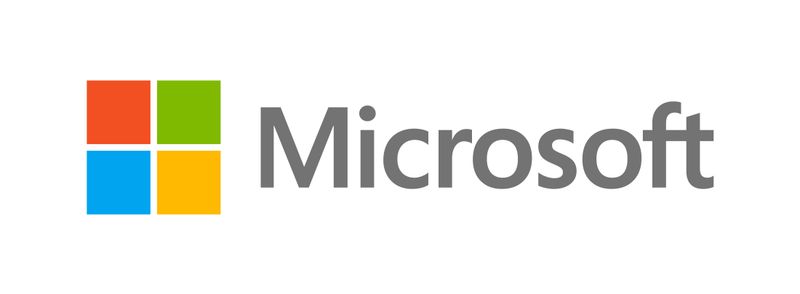
Microsoft’s logo, featuring four colored squares, was introduced in 2012 to represent the company’s diverse product families, including Windows, Office, and Xbox.
The simple geometric design reflects Microsoft’s commitment to innovation and inclusivity, aligning with its mission to empower every person and organization on the planet to achieve more.
The vibrant colors convey a sense of creativity and technological advancement, appealing to a global audience. As a leader in the software industry, Microsoft’s logo embodies the brand’s dedication to delivering comprehensive solutions that enhance productivity and connectivity.
29. Cisco
Cisco’s logo features stylized vertical lines that resemble the iconic Golden Gate Bridge, paying homage to the company’s roots in the San Francisco Bay Area. This design symbolizes connectivity and communication, core elements of Cisco’s mission to shape the future of the internet.
The sleek and modern design reflects the brand’s commitment to innovation and technological advancement. As a leader in networking solutions, Cisco’s logo embodies the company’s dedication to connecting people and devices around the world, fostering a more inclusive and connected global community.
30. Walmart
Walmart’s logo, featuring a spark symbol, was introduced in 2008 to convey inspiration and innovation. This emblem reflects the brand’s commitment to providing affordable products and services that improve customers’ lives.
The simple and modern design aligns with Walmart’s mission to save people money so they can live better. The bright yellow color conveys warmth and optimism, appealing to a broad audience.
As a symbol of value and convenience, Walmart’s logo captures the essence of a brand that strives to make everyday life more accessible and enjoyable for its customers.
31. Porsche
Porsche’s logo combines elements from the Stuttgart coat of arms, featuring a prancing horse, and the crest of the former state of Württemberg. This design reflects the brand’s pride in its German heritage and commitment to engineering excellence.
The sleek and sophisticated emblem exudes luxury and performance, aligning with Porsche’s reputation for crafting high-performance sports cars. The bold colors and intricate details convey a sense of tradition and innovation, appealing to automotive enthusiasts worldwide.
As a symbol of prestige and quality, Porsche’s logo embodies the brand’s dedication to pushing the boundaries of automotive design.
32. Paramount
Paramount’s logo, established in 1912, features a mountain surrounded by 24 stars, representing the studio’s original roster of actors. The mountain, inspired by Utah’s Ben Lomond, symbolizes cinematic excellence and Hollywood’s golden era.
This iconic emblem reflects Paramount’s commitment to storytelling and entertainment, resonating with audiences worldwide. The stars convey a sense of prestige and aspiration, aligning with the studio’s reputation as a leader in the film industry.
As a symbol of creativity and imagination, Paramount’s logo captures the essence of a brand that has shaped the landscape of cinema for over a century.
33. Burger King
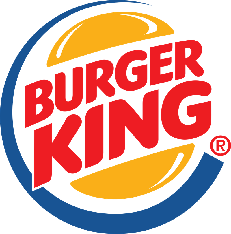
Burger King’s logo, featuring ‘bun halves’ that embrace the brand name, cleverly reflects the shape of a burger. This design element emphasizes the brand’s focus on quality fast food and its dedication to serving delicious burgers.
The vibrant colors and playful design convey a sense of fun and enjoyment, appealing to a wide range of consumers. As a symbol of taste and convenience, Burger King’s logo captures the essence of a brand that values flavor and customer satisfaction.
This emblem invites customers to enjoy a satisfying meal in a welcoming and friendly environment.
34. Puma
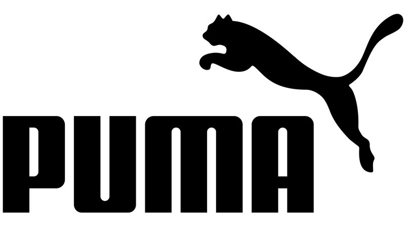
Puma’s logo, originally named ‘Ruda’ by founder Rudolf Dassler, was rebranded to align with the athletic cat, the puma. The leaping puma embodies speed, power, and agility, core attributes of the brand’s sportswear and footwear.
The sleek design and dynamic form convey a sense of movement and competitiveness, appealing to athletes and sports enthusiasts. As a symbol of performance and innovation, Puma’s logo reflects the brand’s commitment to empowering individuals to push their limits and achieve greatness.
This emblem represents a brand that values strength, resilience, and the spirit of competition.
35. Audi
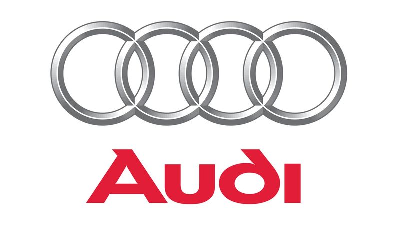
Audi’s logo, featuring four interlinked rings, represents the 1932 merger of four companies: Audi, DKW, Horch, and Wanderer, into Auto Union. This design symbolizes unity and innovation, aligning with the brand’s commitment to engineering excellence and cutting-edge technology.
The sleek and modern emblem reflects Audi’s reputation for crafting high-quality vehicles that combine performance and luxury. As a symbol of prestige and sophistication, Audi’s logo resonates with automotive enthusiasts worldwide, capturing the essence of a brand that values tradition and forward-thinking solutions.
36. Ferrari
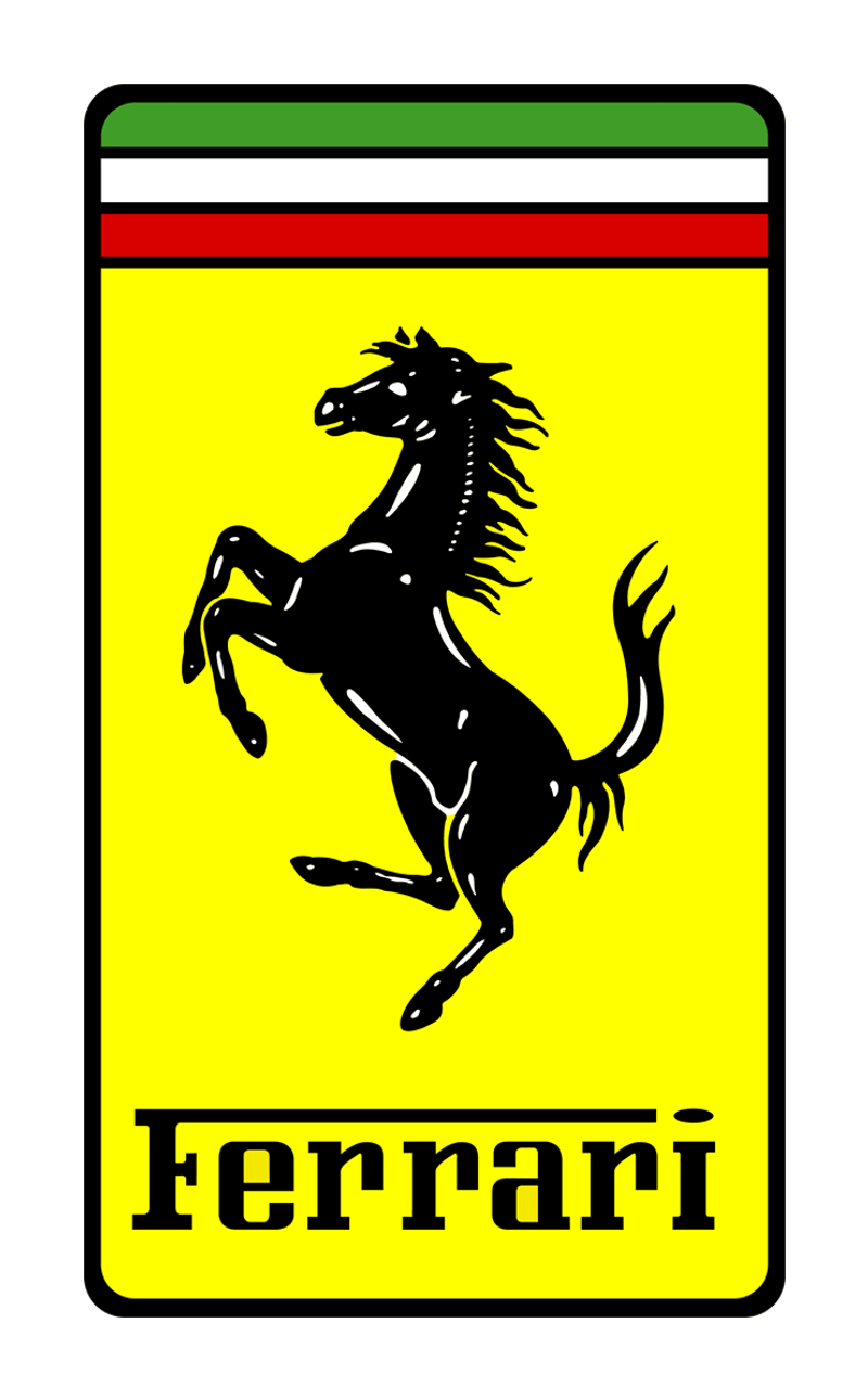
Ferrari’s iconic prancing horse logo was given to Enzo Ferrari by the parents of WWI flying ace Francesco Baracca. The horse symbolizes power and speed, embodying the brand’s dedication to high-performance vehicles.
The yellow background pays homage to Modena, Italy, Ferrari’s hometown, reflecting the brand’s rich Italian heritage. This emblem exudes luxury and sophistication, aligning with Ferrari’s reputation for crafting world-class sports cars.
As a symbol of excellence and passion, Ferrari’s logo captures the spirit of a brand that pushes the boundaries of automotive design and performance.
37. Playboy

Playboy’s logo, featuring a rabbit wearing a bow tie, was sketched by Art Paul for the magazine’s second issue. This playful design was chosen for its whimsical and mischievous connotation, resonating with the brand’s sophisticated yet cheeky image.
The sleek black-and-white design conveys elegance and timelessness, appealing to a global audience. As a symbol of luxury and allure, Playboy’s logo reflects the brand’s commitment to celebrating lifestyle and entertainment.
This emblem captures the essence of a brand that embraces sophistication and playfulness, making it an iconic symbol recognized worldwide.
38. Harley-Davidson
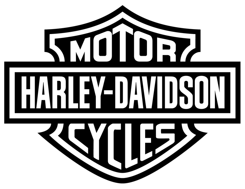
Harley-Davidson’s ‘Bar and Shield’ logo, introduced in 1910, is a symbol of strength, freedom, and the open road. The bold black-and-orange design conveys a sense of power and adventure, aligning with the brand’s reputation for crafting high-performance motorcycles.
This emblem reflects Harley-Davidson’s commitment to quality and innovation in the motorcycle industry, appealing to a passionate community of riders.
As a symbol of individuality and rebellion, Harley-Davidson’s logo captures the spirit of a brand that encourages exploration and self-expression. This iconic logo stands for a lifestyle of freedom and camaraderie.
39. Lacoste

Lacoste’s logo, featuring a crocodile, was inspired by tennis star René Lacoste’s nickname ‘The Crocodile,’ which referenced his tenacity on the court. This emblem was one of the first branding elements ever featured on clothing, setting a precedent for sportswear design.
The sleek and stylish crocodile symbolizes quality, elegance, and performance, aligning with Lacoste’s reputation for crafting high-quality apparel. As a symbol of innovation and tradition, Lacoste’s logo reflects the brand’s commitment to blending sport and style.
This iconic emblem represents a brand that values authenticity and timeless fashion.
40. Chanel

Chanel’s logo, featuring two interlaced ‘C’ letters, was introduced by Coco Chanel in 1925. This iconic emblem symbolizes elegance, luxury, and sophistication, aligning with the brand’s reputation for timeless fashion.
The sleek black-and-white design conveys a sense of simplicity and refinement, appealing to a global audience. Some believe the logo was inspired by the Château de Crémat’s stained-glass windows, while others see it as a representation of Coco Chanel’s initials.
As a symbol of creativity and innovation, Chanel’s logo reflects the brand’s commitment to redefining style and empowering individuals through fashion.
41. Samsung
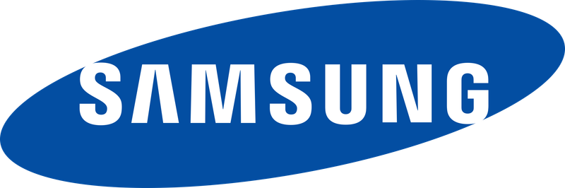
Samsung’s logo has evolved significantly since the company was founded in 1938. The name ‘Samsung’ means ‘three stars’ in Korean, a nod to its origins. The current sleek blue oval design conveys a sense of modernity and technological innovation, aligning with Samsung’s reputation as a global tech leader.
The cool blue color and minimalist design appeal to a wide audience, reflecting the brand’s commitment to quality, innovation, and customer satisfaction. As a symbol of progress and connectivity, Samsung’s logo embodies the brand’s dedication to pushing the boundaries of technology and enhancing everyday life.
42. Toyota
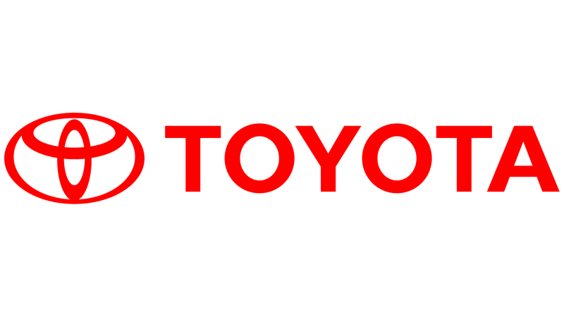
Toyota’s logo, featuring three interlocking ellipses, was introduced in 1989 to represent the unification of the customer’s heart, the product’s heart, and the expanding technological possibilities.
This design symbolizes Toyota’s commitment to quality, innovation, and customer satisfaction. The sleek and modern emblem reflects the brand’s dedication to crafting reliable and high-performance vehicles.
As a symbol of progress and unity, Toyota’s logo resonates with customers worldwide, capturing the essence of a brand that values tradition and forward-thinking solutions. This emblem represents Toyota’s mission to enrich lives through innovative mobility solutions.