Logos are more than just pretty designs for companies. They often contain hidden messages, clever symbolism, and fascinating backstories that most people never notice. These visual secrets help brands tell their stories in a tiny space while making their marks more memorable. Ready to see familiar logos in a whole new light?
1. Apple’s Forbidden Fruit
Knowledge and temptation blend perfectly in Apple’s iconic logo. The bitten apple symbolizes the biblical story of Adam and Eve’s taste of forbidden knowledge – fitting for a company that puts information at our fingertips.
The bite mark serves a practical purpose too. When the logo appears in smaller sizes, the bite ensures nobody mistakes it for a cherry or tomato. This clever detail has been part of Apple’s identity since 1977.
Designer Rob Janoff created the symbol, though contrary to popular belief, it wasn’t a tribute to pioneering computer scientist Alan Turing, who died after eating a cyanide-laced apple.
2. Nike’s Swoosh of Victory
Speed captured in a single curve – that’s the genius of Nike’s Swoosh. Graphic design student Carolyn Davidson created this masterpiece in 1971 for just $35 (though Nike later rewarded her with stock now worth millions).
The elegant mark represents the wing of Nike, the Greek goddess of victory, perfectly embodying the brand’s athletic spirit. Phil Knight, Nike’s co-founder, wasn’t initially impressed with the design, famously remarking, “I don’t love it, but it will grow on me.”
His prediction proved accurate – the Swoosh has become one of the most recognizable symbols worldwide, communicating motion and achievement without saying a word.
3. Amazon’s A-to-Z Smile

Look closely at Amazon’s logo and you’ll spot a cheerful yellow arrow connecting the letters ‘A’ and ‘Z’. This clever design element communicates that Amazon sells everything from A to Z, a perfect representation of the company’s vast inventory.
The arrow doubles as a smile, suggesting customer satisfaction and happiness. The curve points from left to right, creating a forward-looking impression that reflects Amazon’s innovative approach to business.
Designed in 2000 by Turner Duckworth, this logo replaced the earlier river-themed design and has become instantly recognizable worldwide. The simplicity masks brilliant marketing psychology at work.
4. FedEx’s Hidden Arrow
Blink and you’ll miss it – between the ‘E’ and ‘x’ in FedEx hides a perfect white arrow pointing forward. This clever negative space element wasn’t just a happy accident but a deliberate design choice by Lindon Leader in 1994.
The arrow symbolizes precision, speed, and directional purpose – exactly what you want from a delivery company. Not everyone notices it at first glance, but once seen, it’s impossible to unsee.
FedEx has maintained this design element across its various divisions, simply changing colors to differentiate services: orange for Express, green for Ground, and blue for Office. The logo has won over 40 design awards for its brilliant simplicity.
5. Google’s Colorful Rebellion
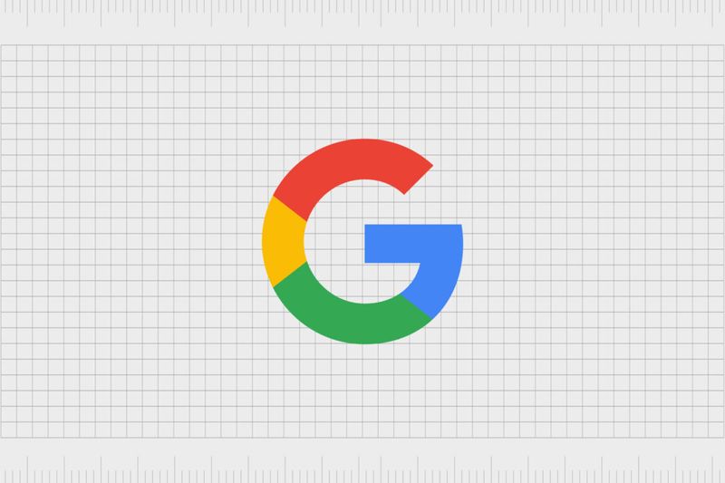
Google’s playful logo isn’t just pretty – it’s a statement about breaking rules. The primary colors (blue, red, yellow) are interrupted by a secondary color (green), deliberately breaking traditional design patterns. This visual rebellion perfectly represents Google’s mission to do things differently.
The original logo was created by co-founder Sergey Brin using the free graphics program GIMP. The simplicity of the typeface (originally Catull, now a custom sans-serif called Product Sans) balances the vibrant colors.
The color sequence – blue, red, yellow, blue, green, red – has remained consistent through multiple redesigns, maintaining brand recognition while the company evolved from upstart search engine to global tech giant.
6. McDonald’s Golden Architectural Arches
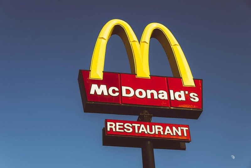
Those famous golden arches weren’t originally meant to be a logo at all. They began as actual architectural elements – stylized arches supporting McDonald’s restaurants designed by architect Stanley Meston in the 1950s.
When viewed from a certain angle, these arches formed an ‘M’ shape. Marketing genius Ray Kroc recognized their potential as a brand symbol. By 1968, the arches had merged into the simplified ‘M’ logo we recognize today.
The bright yellow color was chosen for its visibility and psychological associations with happiness and optimism. Combined with red (stimulating appetite), these colors create the perfect fast-food visual formula – instantly recognizable from highways worldwide.
7. Coca-Cola’s Flowing Script
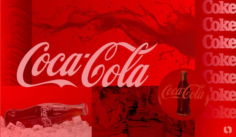
The elegant curves of Coca-Cola’s logo have remained virtually unchanged since 1886, making it one of the oldest continuous logos in existence. Frank Mason Robinson, the company’s bookkeeper, suggested the distinctive Spencerian script – a popular handwriting style for business documents at the time.
Robinson believed the flowing letters would stand out in advertising. He was right – the logo’s graceful design has become perhaps the most recognized trademark worldwide, transcending language barriers and cultural differences.
The red color was initially chosen for practical reasons – to paint barrels so tax agents could distinguish them from alcohol during transportation. Now that vibrant red is inseparably linked with the brand’s identity across more than 200 countries.
8. Pepsi’s Patriotic Globe
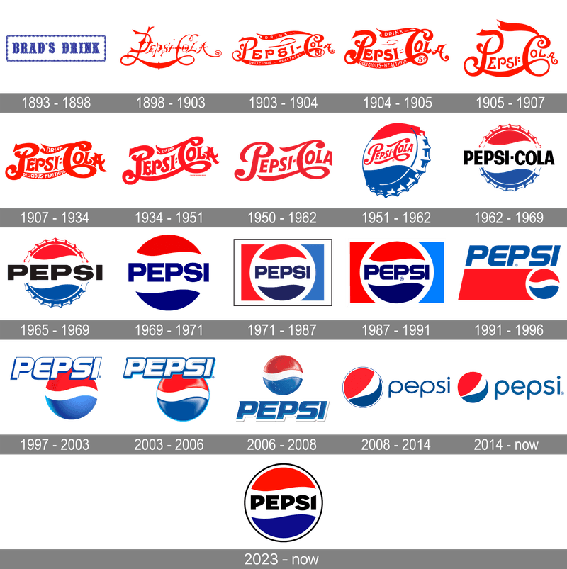
Pepsi’s circular logo wasn’t always the sleek design we know today. The red, white, and blue color scheme was adopted during World War II as a show of patriotic support, draping the bottle cap in American colors to boost sales to GIs and patriotic consumers.
Over decades, the logo evolved from a simple wordmark to the current “Pepsi Globe” design. The latest version, created in 2008 by Arnell Group, cost a reported $1 million and came with a 27-page document explaining how the design relates to concepts like the Earth’s magnetic field and the Golden Ratio.
Some see a person with arms raised in the current design – a subtle nod to Pepsi’s “joy of cola” marketing approach.
9. IBM’s Speed Stripes
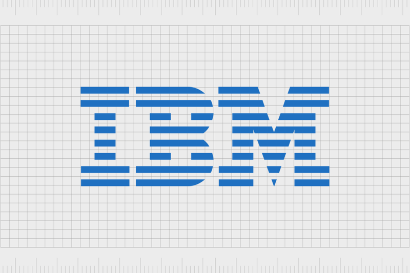
IBM’s iconic striped logo represents much more than a corporate identity – it’s a statement about transformation. Legendary designer Paul Rand created the striped version in 1972 to suggest “speed and dynamism” as the company pivoted from mechanical business machines to computing technology.
The horizontal stripes cutting through the solid letters create a sense of movement and energy. They also solved a practical problem – the stripes prevented the logo from creating a heavy, dark block when printed in newspapers and magazines.
The distinctive 8-bar logo has remained virtually unchanged for over 50 years, demonstrating the power of timeless design. The blue color was chosen to represent trust and reliability – essential qualities for a technology company.
10. Disney’s Personal Signature
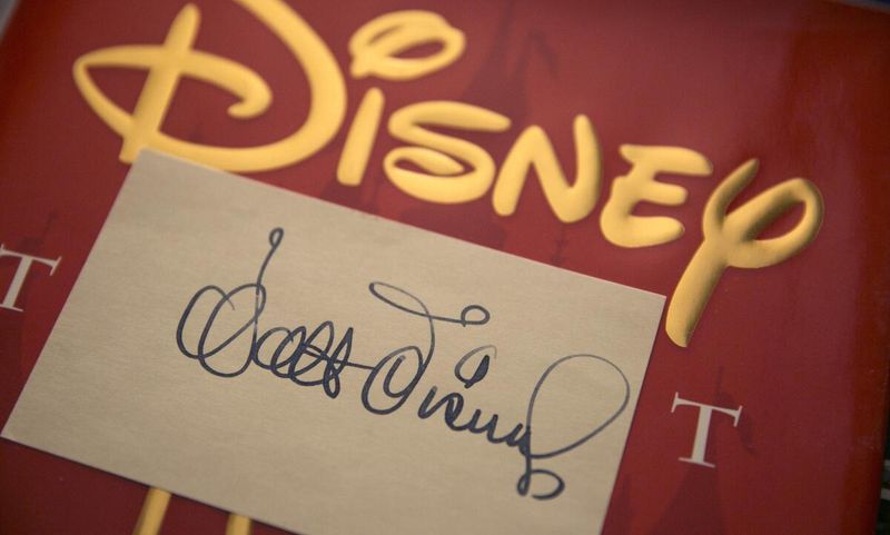
Walt Disney signed his company’s future into existence – literally. The famous Disney logo is based on Walt’s actual signature, though slightly stylized for better recognition and reproduction.
The personal touch perfectly captures the company’s founder-driven creative vision. Early versions were simpler, but the elaborate script we know today emerged in the 1960s and has remained largely unchanged since, despite the company’s massive expansion beyond animation.
The castle silhouette was added later to emphasize Disney’s fairy tale associations. Walt practiced his signature extensively to create something distinctive enough for autographs yet legible enough for business purposes – never imagining it would become one of the world’s most valuable trademarks.
11. Adidas’ Mountain Challenge
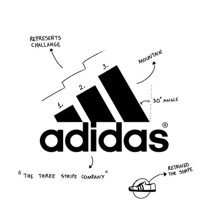
The three stripes of Adidas represent more than just a memorable visual pattern – they form a mountain. This symbolic mountain represents the challenges athletes face and the obstacles they must overcome to achieve greatness.
Founder Adi Dassler purchased the three-stripe design from Finnish company Karhu Sports for the equivalent of €1,600 and two bottles of whiskey in 1951. Initially practical, the stripes provided structural support to the sides of athletic shoes.
The current mountain-shaped logo debuted in 1990, though many Adidas products still feature just the three parallel stripes. The simplicity allows for endless creative variations while maintaining instant brand recognition across sports equipment, apparel, and fashion lines.
12. BMW’s Bavarian Sky Quarters
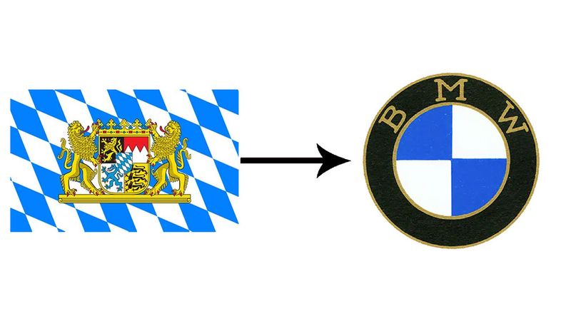
Contrary to popular belief, BMW’s logo isn’t a spinning propeller. The blue and white quadrants actually represent the Bavarian flag colors, honoring the company’s German origins in the state of Bavaria.
The propeller myth began with a 1929 advertisement showing the logo overlaid on a spinning aircraft engine – logical since BMW manufactured aircraft engines before making cars. The company embraced this misconception for years before officially clarifying the true meaning.
The circular design has remained remarkably consistent since its creation in 1917, with only minor refinements. The current version, introduced in 2020, features a transparent ring that gives the logo a more modern, minimalist appearance while maintaining the iconic blue and white checker pattern.
13. LG’s Winking Face
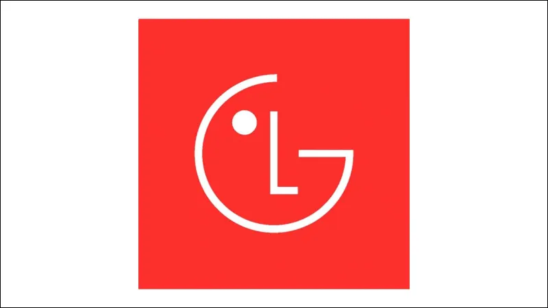
The LG logo cleverly transforms the letters ‘L’ and ‘G’ into a friendly winking face. The ‘L’ forms the nose while the ‘G’ creates the outline of the face, with the dot representing an eye.
This humanized design reflects the company’s tagline “Life’s Good” and emphasizes their focus on creating technology that improves human experiences. The red color conveys energy and passion, while the rounded shape suggests approachability.
Beyond the face, some see a modified Pac-Man character in the design – appropriate for a technology company. The logo’s simple yet playful nature helps LG stand out in the competitive electronics market while being easily recognizable across global markets regardless of language.
14. Toyota’s Threaded Ovals
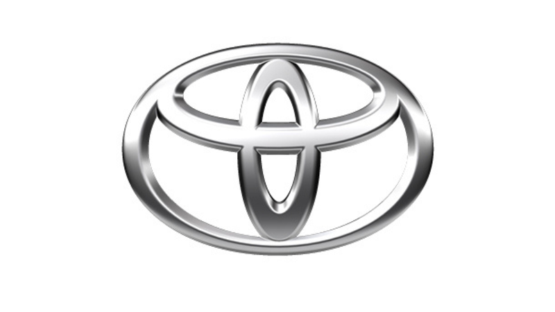
Toyota’s logo contains far more symbolism than most realize. The overlapping ovals represent the heart of the customer and the heart of the company joining together, symbolizing mutual trust and beneficial relationships.
The space in the background forms a ‘T’ for Toyota, while the entire logo resembles a steering wheel. Introduced in 1989, the design took over five years to develop, with designers creating nearly 50 different versions before selecting the final design.
The logo contains every letter of “TOYOTA” hidden within its oval shapes – a fact that delights design enthusiasts. The silver color represents creativity, sophistication, and perfection, values that align with the Japanese automaker’s commitment to quality and innovation.
15. Cisco’s Golden Gate Bridge Lines
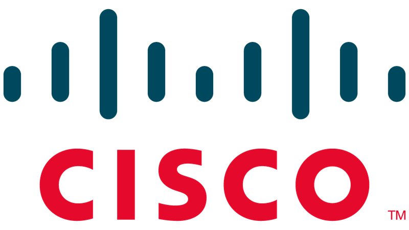
San Francisco’s most famous landmark inspired Cisco’s distinctive logo. The vertical lines represent the towers and cables of the Golden Gate Bridge, honoring the company’s birthplace – founders Leonard Bosack and Sandy Lerner were Stanford University employees when they founded the tech giant.
The name “Cisco” itself comes from San Francisco, with the logo reinforcing this connection. Originally, the design featured a more literal bridge representation, but it evolved into the current abstract version.
The blue color symbolizes strength and stability – important qualities for a networking company. The horizontal lines also evoke digital signals traveling across networks, cleverly connecting the company’s geographic origins with its technological mission of connecting people and devices.
16. Meta’s Infinite Loop
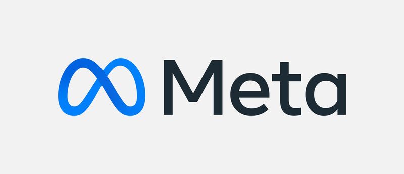
When Facebook rebranded as Meta in 2021, they adopted an infinity symbol logo that represents endless possibilities in the metaverse. The continuous loop suggests connection and expansiveness – core concepts for a company focused on building virtual worlds and social experiences.
The logo’s blue gradient color scheme maintains a visual connection to Facebook’s heritage while the 3D perspective suggests depth and dimension. Viewed from certain angles, the symbol resembles the letter ‘M’ for Meta.
Designer Zach Stubenvoll explained that the infinity shape was chosen because it’s “a continuous loop of connection and possibility that takes on the living form of a path.” The fluid design intentionally moves away from the rigid squares and rectangles of traditional tech logos.
17. Ferrari’s Prancing War Horse
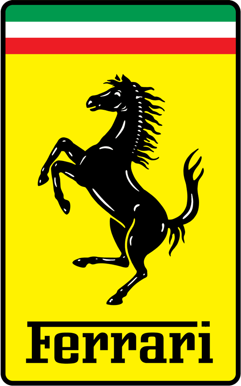
Ferrari’s iconic prancing horse has galloped straight out of World War I history. The emblem originally adorned the plane of Italian flying ace Francesco Baracca, who claimed 34 aerial victories before being killed in action in 1918.
After Baracca’s death, his mother suggested to Enzo Ferrari that he use the symbol for good luck. Enzo added the canary yellow background – the color of his hometown of Modena – to the black horse.
The horse stands on its hind legs, suggesting power and dynamism. Ferrari modified the original design by pointing the tail upward instead of downward as it appeared on Baracca’s plane. Since 1929, this symbol has represented automotive excellence and racing heritage worldwide.
18. NBC’s Colorful Peacock
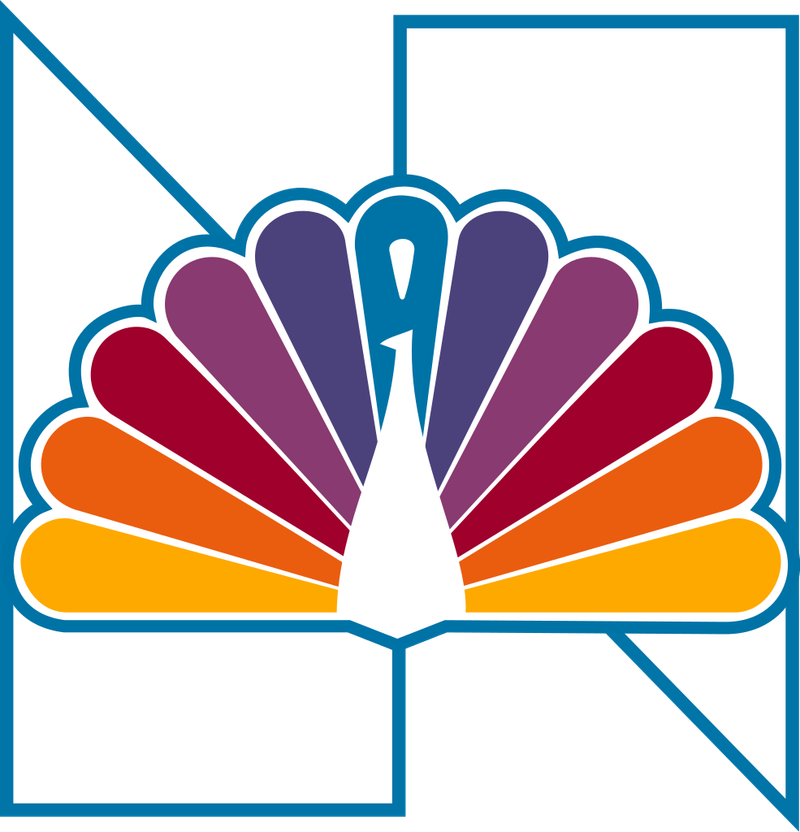
NBC’s peacock wasn’t just chosen for its beauty – it had a practical purpose. Introduced in 1956, the colorful bird showcased the network’s new color broadcasting capabilities at a time when most television was still black and white.
The original design featured 11 feathers, each representing a division of NBC. Today’s simplified version has six feathers, colored (from left to right) yellow, orange, red, purple, blue, and green. The peacock faces right, symbolizing forward-looking progress.
Designer John J. Graham created the original peacock, which was nicknamed the “Laramie Peacock” after the sponsor of its first appearance. The current version, designed by Chermayeff & Geismar in 1986, has become one of television’s most enduring symbols.
19. Toblerone’s Bear in the Mountain
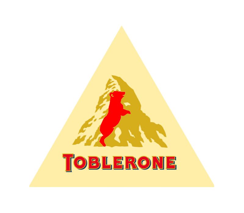
Look closely at the mountain on Toblerone’s packaging and you’ll discover a hidden bear standing on its hind legs. This isn’t random – the bear represents Bern, Switzerland, the chocolate’s birthplace, known as the “City of Bears.”
The mountain itself depicts the Matterhorn, one of Switzerland’s most famous peaks. Creator Theodor Tobler designed the triangular chocolate shape in 1908, allegedly inspired by a pyramid-shaped dancer formation he saw at the Folies Bergères in Paris.
The name combines Tobler’s family name with “torrone,” the Italian word for honey-almond nougat. Eagle-eyed observers might also spot that the mountain contains the word “ONE” hidden in its slopes – another clever design detail in this chocolate’s rich visual identity.
20. Baskin-Robbins’ 31 Flavors
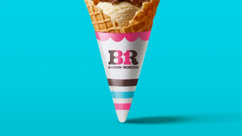
The Baskin-Robbins logo contains a sweet secret – the number “31” is cleverly hidden in the pink portions of the “BR” initials. This represents the company’s original promise of 31 flavors, offering customers a different ice cream option for each day of the month.
When founders Burt Baskin and Irv Robbins merged their ice cream parlors in 1953, they wanted to emphasize variety in an era when most shops offered only vanilla, chocolate, and strawberry. The logo’s pink and blue colors were chosen to convey a sense of fun and sweetness.
Redesigned in 2005 by Ogilvy & Mather, the current logo maintains the hidden “31” while updating the overall look to appear more modern and appetizing.
21. Beats by Dre’s Sound Profile

The Beats logo is a masterclass in minimalist design with maximum meaning. The lowercase ‘b’ resembles a person wearing headphones, with the circular part representing a human head and the straight line forming the headband.
This visual metaphor perfectly captures the personal audio experience the brand promotes. Created in 2006 by Dr. Dre and Jimmy Iovine, the logo’s simplicity allows it to work across various applications from tiny earbuds to massive billboards.
The bold red color symbolizes energy, passion, and power – qualities the brand associates with music. The clean, contemporary design helped position Beats as a fashion accessory as much as an audio device, contributing to Apple’s decision to acquire the company for $3 billion in 2014.
22. Wendy’s Motherly Collar
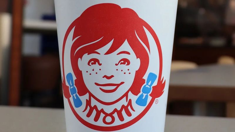
Hidden in plain sight on Wendy’s logo is a secret message – the word “MOM” appears in the ruffles of the redheaded girl’s collar. Whether intentional or coincidental, this detail reinforces the brand’s emphasis on homestyle cooking and comfort food.
The pigtailed girl in the logo is actually founder Dave Thomas’s daughter, Melinda Lou “Wendy” Thomas. As a child, she couldn’t pronounce her own name, instead saying “Wenda,” which inspired the restaurant’s name when it launched in 1969.
The logo underwent a major update in 2013, modernizing Wendy’s appearance while maintaining her signature red hair and freckles. The hidden “MOM” message survived this redesign, continuing to subtly communicate homemade quality.