Remember walking down the aisles of your local grocery store as a kid? Those colorful logos overhead weren’t just signs—they were landmarks of our childhood shopping trips. These emblems became so familiar that even today, they can trigger waves of nostalgia. Let’s take a cart down memory lane and revisit the grocery store logos that defined our early shopping experiences.
1. Kroger’s Bold Red K
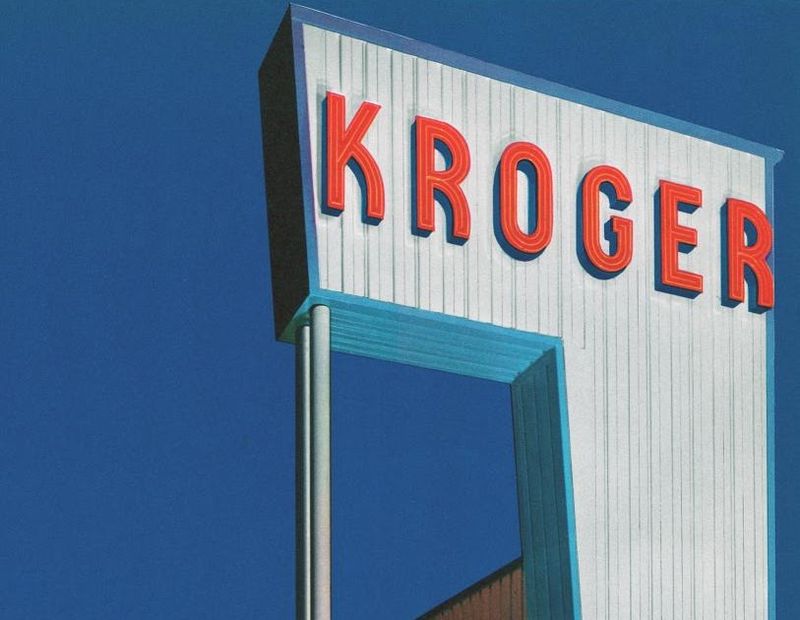
Nothing says American grocery shopping quite like Kroger’s distinctive red K. Founded in 1883, this supermarket giant’s emblem evolved from a simple text logo to the rounded K we recognize today.
The blue oval background made it pop against store facades nationwide, becoming a trusted symbol for families shopping for weekly essentials. Generations of shoppers have pushed carts beneath this iconic sign.
2. A&P’s Red Circle
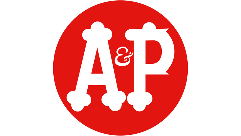
Long before many modern chains existed, the Great Atlantic & Pacific Tea Company (A&P) dominated American grocery shopping. Their simple red circle logo with white A&P lettering symbolized quality groceries for nearly a century.
Grandparents often reminisce about A&P’s red storefront signs that welcomed shoppers across America. Though many locations closed by 2015, this logo remains etched in the memories of anyone who grew up before the 1990s.
3. Safeway’s Curvy S

Safeway’s elegant S logo represented one of America’s first true supermarket chains. The curved white S against a red background became synonymous with neighborhood grocery shopping since its 1915 founding.
Kids of the 80s and 90s might remember the slight logo redesigns while still maintaining that distinctive S shape. Many shoppers developed fierce loyalty to Safeway, with its logo serving as a beacon of familiar comfort in changing neighborhoods.
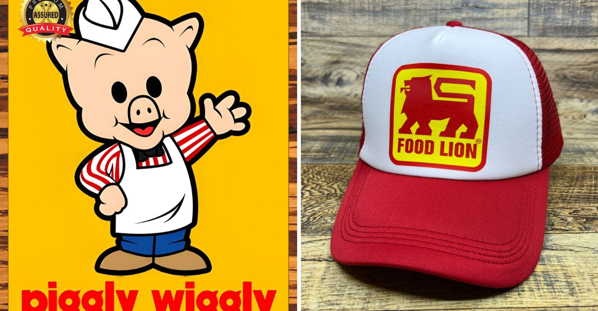
4. Piggly Wiggly’s Cartoon Pig
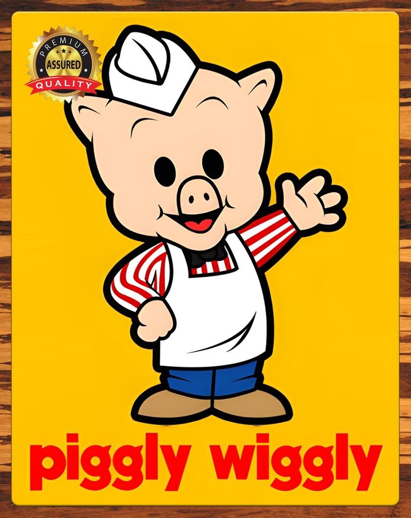
America’s first true self-service grocery store gave us one of the most playful logos in retail history. The cartoon pig in a white apron, sometimes named “Mr. Pig,” brought smiles to shoppers since 1916.
Southern children especially grew up with this whimsical mascot watching over their family shopping trips. The pig’s friendly face represented innovation too—Piggly Wiggly revolutionized how we shop by letting customers select their own items rather than requesting them from clerks.
5. Albertsons’ Swooping A
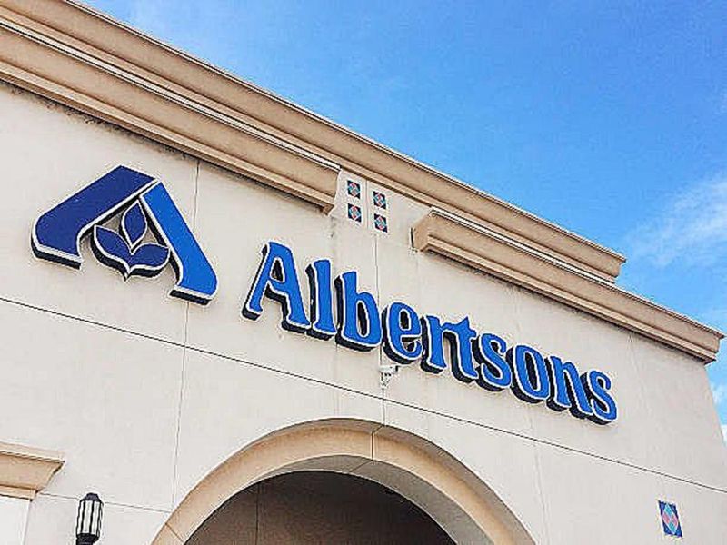
Albertsons’ distinctive blue and orange logo featured a swooping letter A that seemed to soar across storefronts nationwide. Founded in 1939, the chain expanded rapidly during many of our childhoods in the 70s through 90s.
The vibrant color combination made this logo instantly recognizable from parking lots. Young shoppers often associated the Albertsons logo with the free cookies some locations offered at their bakery counters—a highlight of any grocery trip with mom or dad.
6. Winn-Dixie’s Red Check Mark
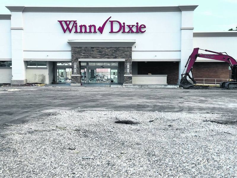
Southeastern childhoods were often punctuated by trips to Winn-Dixie, with its distinctive red check mark logo promising value and quality. The bold red symbol against white backgrounds became a staple sight across Florida, Georgia, Alabama, and beyond.
The logo underwent several revisions during the 80s and 90s, but maintained its check mark heritage. Many remember the excitement of seeing the Winn-Dixie logo on shopping plazas, knowing the store often featured child-height candy displays near checkout lanes.
7. Food Lion’s Bold Feline
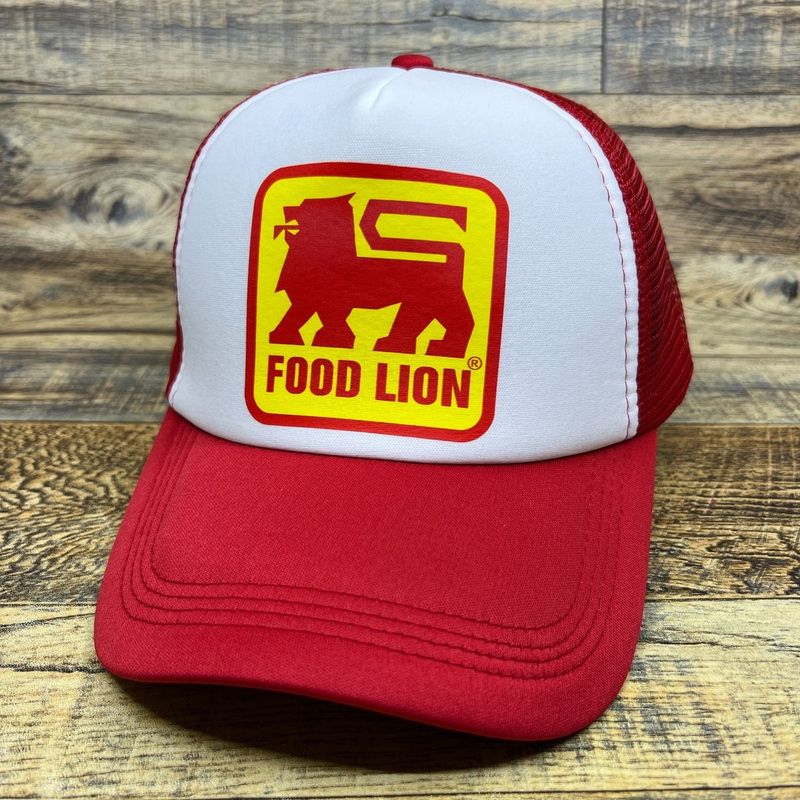
Food Lion’s distinctive red and blue lion head silhouette prowled across grocery storefronts primarily in the Mid-Atlantic and Southeast regions. Originally founded as Food Town in 1957, the chain adopted its leonine identity in the 1980s.
Kids often wondered about the connection between lions and groceries while being dragged along for shopping trips. The simple yet striking logo design made it easy for children to recognize—a helpful landmark when families visited unfamiliar towns.
8. Stop & Shop’s Traffic Signal

Northeast children grew up with Stop & Shop’s clever traffic light logo featuring a red octagon and green circle. This visual play on the store’s name became a beloved sight across New England and the Mid-Atlantic.
The logo underwent modifications over decades but maintained its traffic signal inspiration. For many kids, spotting the distinctive Stop & Shop sign meant the possibility of convincing parents to buy special treats or collect trading stamps that came with purchases.
9. Publix’s Flowing P
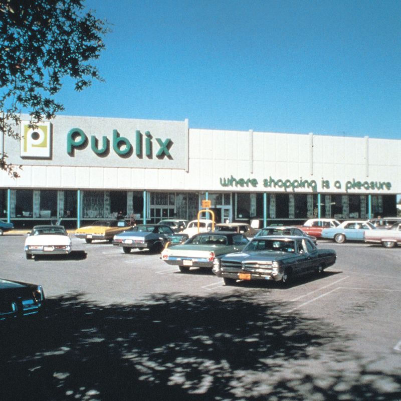
Florida natives and Southern shoppers grew up with Publix’s elegant flowing P logo in various shades of green. Founded in 1930, Publix created a distinctive script-like emblem that communicated a more upscale grocery experience.
Children of the 80s and 90s often associated the Publix logo with the free cookies handed out at the bakery department. The clean, flowing lines of the P symbolized the chain’s reputation for spotless stores and excellent customer service that became part of Southern grocery culture.
10. Acme’s Red Oval
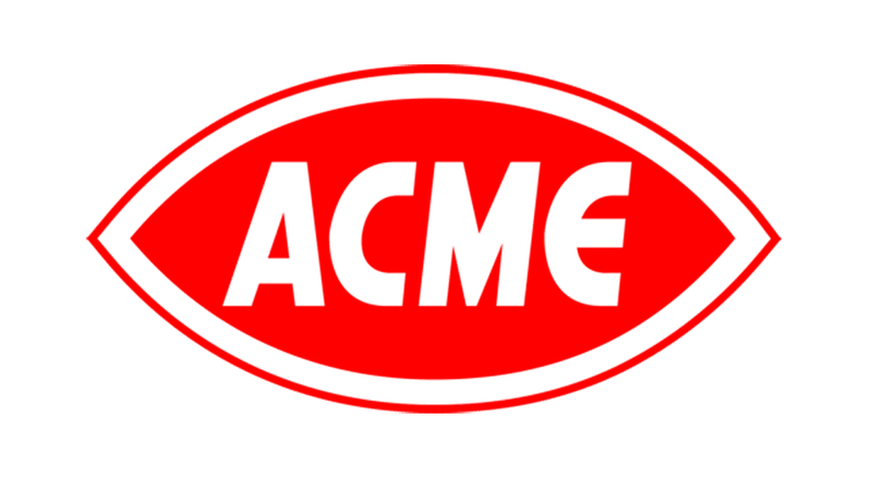
Acme Markets featured a bold red oval logo with white lettering that became synonymous with grocery shopping in Pennsylvania, New Jersey, Delaware, and Maryland. The simple yet striking design remained largely unchanged throughout many childhoods of the 60s through 90s.
The name itself evoked cartoon memories for kids who watched Road Runner outwit Wile E. Coyote and his Acme products. Parents dragging children through Acme’s aisles had no idea how deeply this straightforward logo would embed itself in their nostalgic memories.
11. Ralph’s Stylized Script
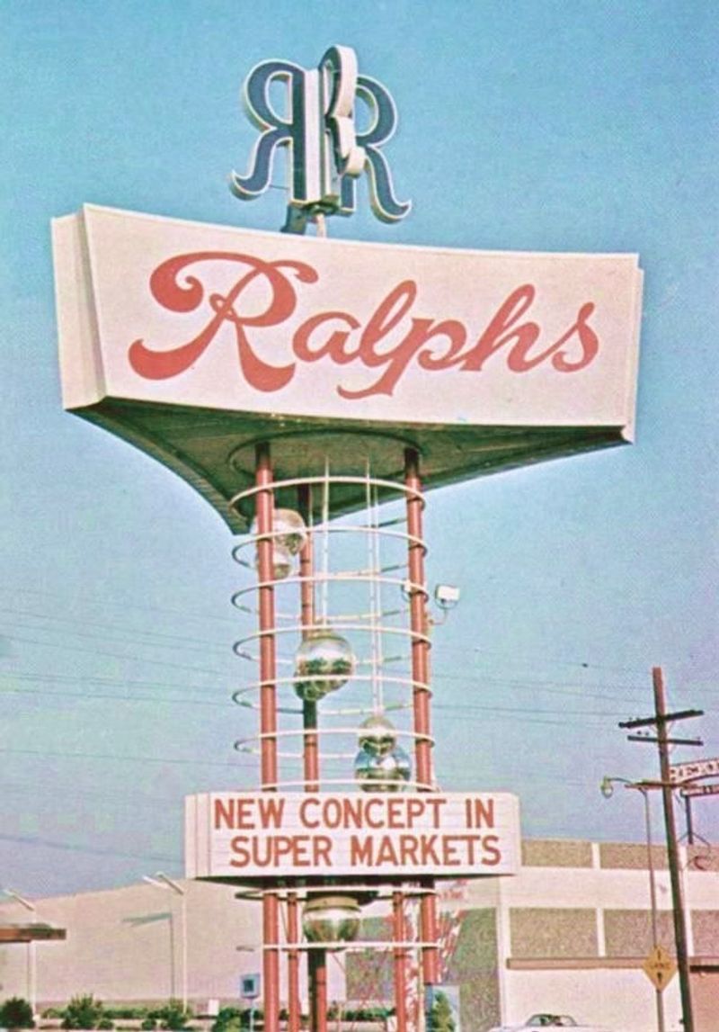
West Coast children recognized Ralph’s elegant script logo adorning supermarkets across California. The flowing cursive lettering suggested a personal touch, as if Ralph himself might be stocking the shelves.
Founded in 1873, the chain’s logo evolved while maintaining its distinctive script style. Kids of the 80s and 90s often associated the Ralph’s sign with weekend shopping trips and the possibility of receiving balloon giveaways that some locations offered to young shoppers.
12. Pathmark’s Colorful Path
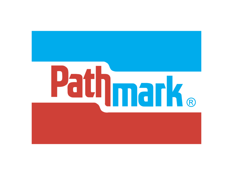
Northeast families shopped under Pathmark’s distinctive logo featuring a stylized letter P formed by a red and blue path. This vibrant emblem adorned stores primarily in New York, New Jersey, and Pennsylvania throughout the 70s, 80s, and 90s.
The logo’s path imagery suggested a journey through grocery aisles. Many children associated the Pathmark sign with the store’s frequent double-coupon promotions that made parents particularly eager to shop there, often dragging reluctant kids along for lengthy savings-focused expeditions.
13. Vons’ Striking V
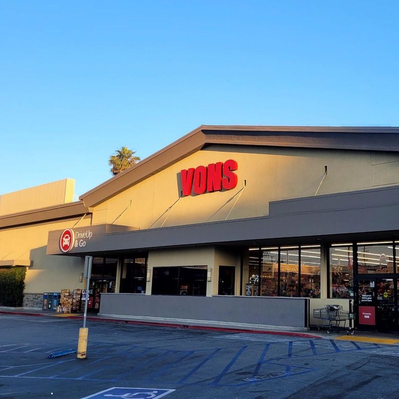
Southern California childhoods featured Vons’ bold red V logo prominently in the grocery landscape. Founded in 1906, the chain’s emblem evolved into a distinctive angular V that became instantly recognizable across the region.
The simple yet modern design stood out among competitors. Kids growing up in the 80s and 90s often spotted Vons logos while riding in car backseats, knowing it as their family’s regular shopping destination where they might convince parents to purchase special cereals or treats from end-cap displays.